Overview
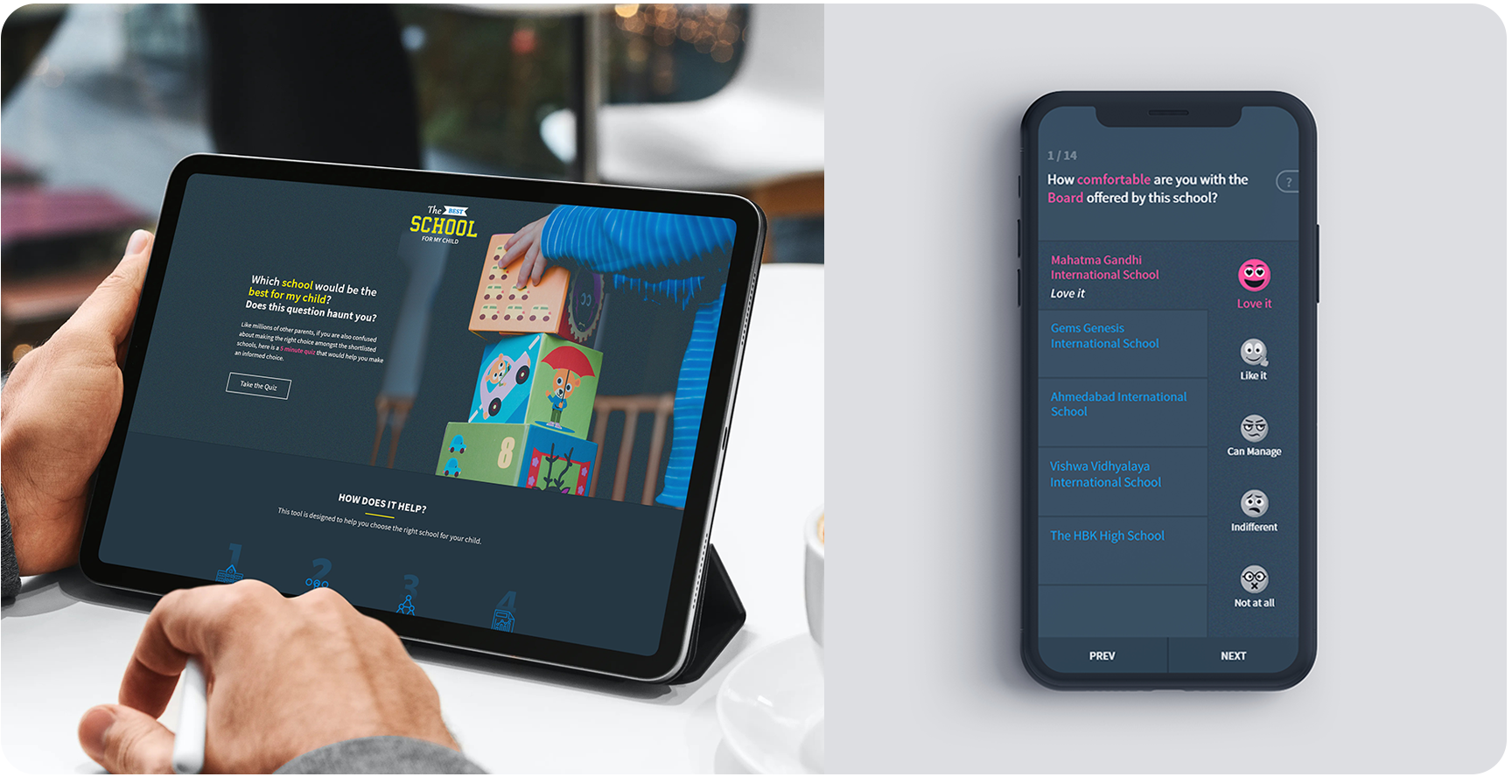
Best school for my child is an online tool for parents to compare selected schools
and get the best one of them for their child. This tool is a response to the
growing need of parents to make a better and informed choice rather than following
the herd. The initial beta version was released including domain area of Ahmedabad City's schools.
Tools: Balsamiq, Adobe Photoshop, Adobe Illustrator, Adobe XD
The Challenge
Fulfilling children's expectations for better education, it is quite difficult for parents
to decide the ideal school, most times they end up choosing the school which was referred
to them but have no clue about it’s system and facilities.
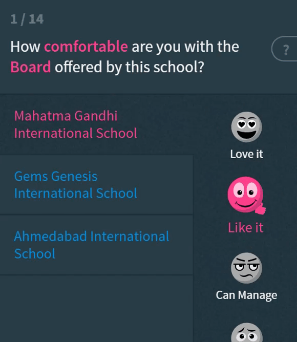
The challenge was to create an user friendly tool that can satisfy parents' problems by questioning them and let
them rate each school with different values. Each question contains information about various
facilities that school provides to the children, that way they can compare schools and get the
best one at the end as a result which they can share with other parents.
Kickoff
The Approach
The best school for my child was initiated with the concept of User-centered design(UCD) &
Mobile-First method. I followed the most efficient design process but instructed to
spend limited hours on research. Parents are going to be the main users, so we started
collecting information about parent’ demographics.
Early Insights
We interviewed 4 parents including stakeholders to get their views, goals and expectations from
the initial idea of the tool in order to collect maximum qualitative and quantitative data.
Here is the summary of key findings and comments by users which was prioritized for the next phase.
The Discovery
Deciding Key factor
Before I could jump into further research, it was important to define success
and understanding of user’s views on the rating system. Something out of the
box that matches the school theme at the same time there should be no
compromise in user interaction affordance and feedback. After detailed research
and discussion with developers, we end up finalizing below types of interaction for ratings.
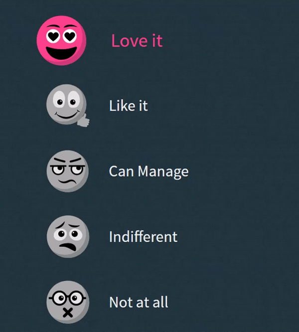
Again we involved parents to decide which one will be the most suitable interaction for
them by asking them a series of questions and most surprisingly they chose tap-based
emoji as their favorite interaction rather than numbers and stars. Reason was that
parents expect the process of choosing the school to be less intimidating and should be
fun while interacting.
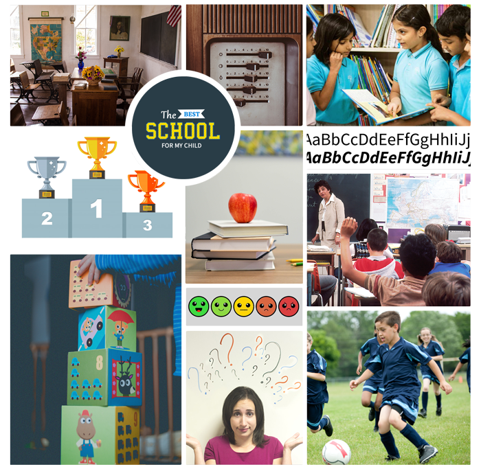
Aligning with Goals
Based on the data we collected from users and stakeholders, I’ve created a mood board to
make sure I and stakeholders are on the same page in terms of visual aspects. Before getting
hands-on the UI, validating user flow and Information architecture is important.
I have intentionally omitted confidential data here.
Moodboard
User Flow
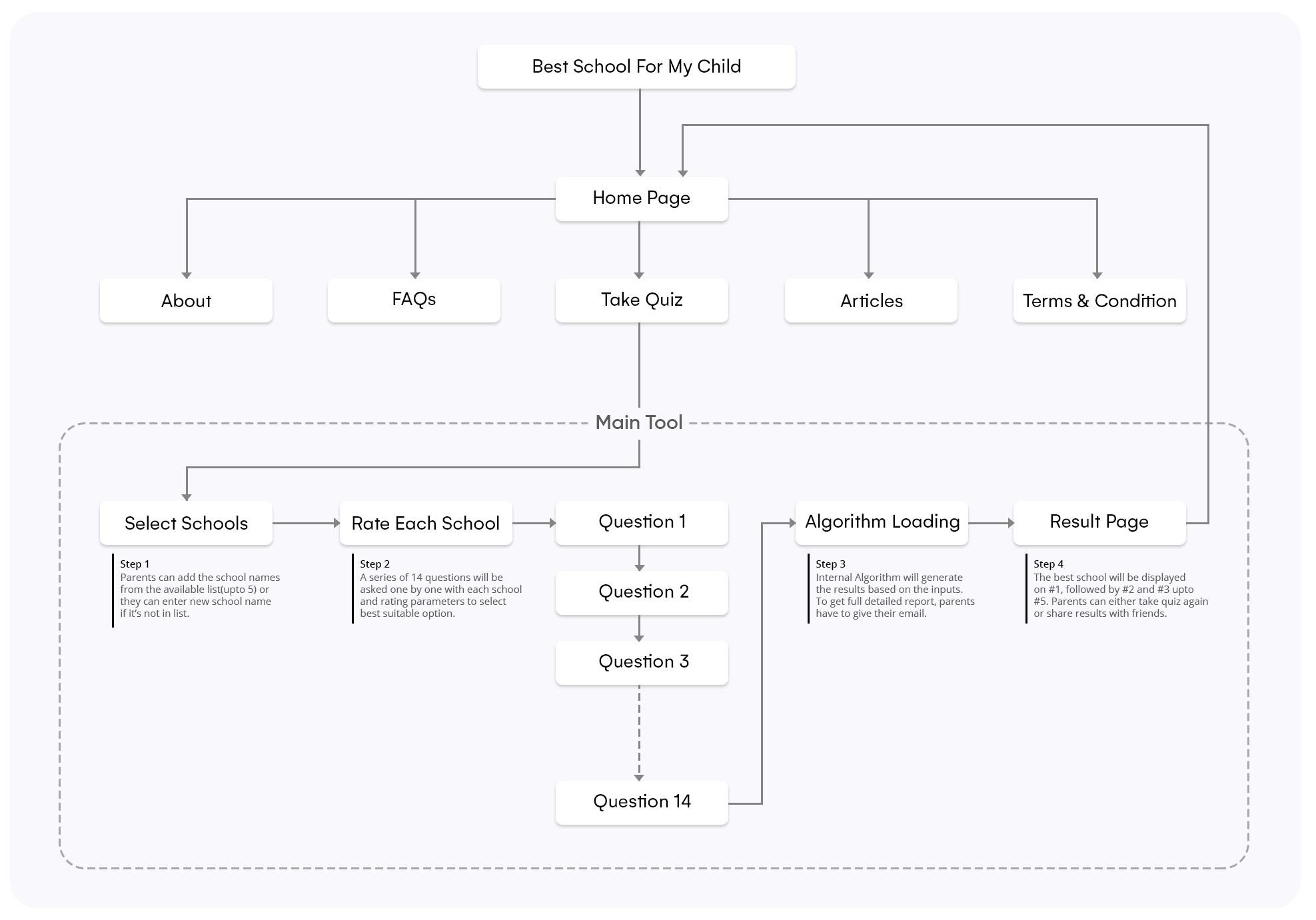
Wireframing & High Fidelity Prototyping
I started creating wireframes using the Balsamiq tool from the final
user flow and information architecture. Since it was the mobile-first approach,
all the UI components were created in the mobile version only. We want parents to get
to know about the tool first and then experience it, so I dividing information documentation
and button actions into sections according to the priorities.
Validating Responsiveness
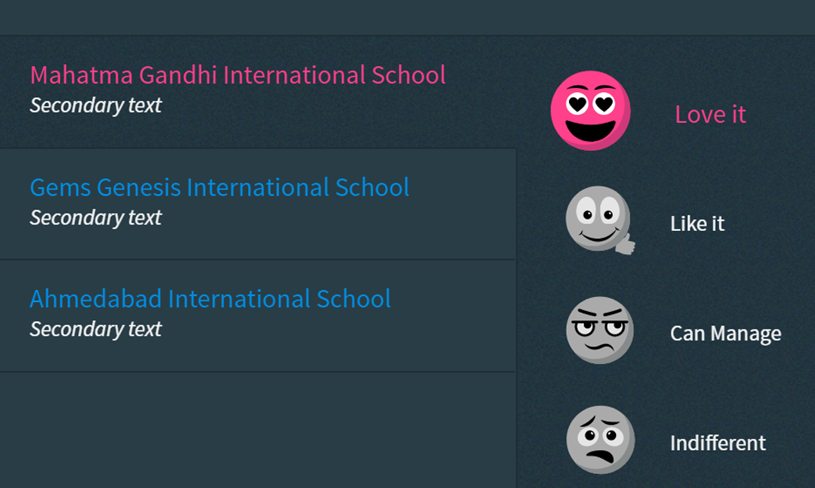
Interactive Emojis
Initially, I started with a simple set of emojis which I modified later to make it more
intuitive and aesthetical to pop up in the UI. Also, there are 14 different questions and for
each question, labels are quite unique which requires different kinds of expressions
from each emoji.
In desktop, the labels are horizontally situated and while hovering/selecting
emoji, the size increment was 1.3x with appropriate defined colors.
In mobile, the labels are below the emojis & a button kept next to the question
in case parents need more information linked to the article page.
Design roadblocks and learnings
I started front-end coding for quiz pages first as it was the MVP and then created
marketing pages. Most pages uses the propeller framework which was developed within Digi-Corp.
However, this was my very first project where I learned how to code structurally and document
them for devs instead of following my own methods. Below are some challenges that I faced during the development:
Five different emojis for five different schools were difficult to add on a screen,
so, I decided to keep emojis commons on the side to reduce complexity & implement
the mechanism where choosing the value for one school the cursor automatically
switches to the next school.
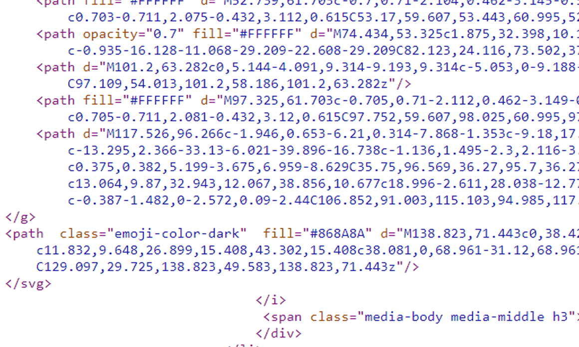
Emoji are interactive so it was rigid to use the .jpeg/.png files. Also,
while hovering or selecting they were supposed to change colors. I used the
SVG file format where I edited them using CSS and applied color accordingly.
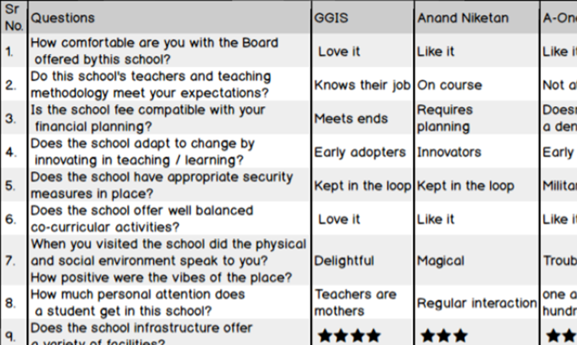
After the quiz on the result page, parents get a detailed report of their ratings as
a .PDF for sharing which was supposed to be standalone file. I created a detailed
structure only using table tag and it’s subtags with no external stylesheets or js.
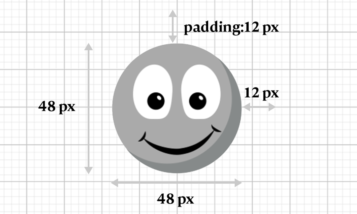
Choosing SVG emojis gave me a lot of freedom in terms of a CSS style and resizing the
shape according to the screen resolutions. However, some emojis do not contain the same
resolutions so for that I have to decide fixed paddings to keep alignment consistent.
Reflections
What I Learned
- Keep users first, no matter how much we assume about requirements but it’s not always the same as what users are expecting. We guessed before the user interview to implement a star based ratings which will be useful but turns out to be a different thing later.
- I was not aware of how to create animation in photoshop until I was given a task to create an animation either using css or photoshop.
- Simplifying and grouping similar objects helps to reduce design clutter/complexity from the User interface.
- Working on full front-end code, making changes back and forth & handling it to the developers taught me how to write code efficiently.